Blog
The World Cup of Printing History with Jim Hamilton
In this Print Media Centr podcast, Jim Hamilton, Museum of Printing board member and social media volunteer, shares his perspective on the #worldcupofprintinghistory Twitter hashtag that the museum ran during the Women’s World Cup in 2019 (and also in 2018 for the Men’s tournament).
https://podcasts.printmediacentr.com/podcast/the-world-cup-of-printing-history-with-jim-hamilton/
Mimeograph Machines
In the days before inkjet printers and Xerox machines, multiple copies were made on mimeograph machines.
In 1876, Thomas Edison filed the first US patent for autographic printing by means of a duplicating press with an electric pen for cutting stencils. A subsequent patent followed, and then Chicago inventor and businessman, Albert Blake Dick, took it to the next level. He merged his efforts with Edison’s, improved the stencils and licensed the patents. In 1887, the A. B. Dick Company released the Model “0” flatbed duplicator selling for $12 ($284 today). Dick named the machine the Edison Mimeograph and it was an immediate success. The company went on to become the world’s largest manufacturer of mimeograph equipment.
Awesome wood type
 This font, beautiful in its size, color and simplicity, is on display in our art gallery. The Museum is fortunate to hold an extensive wood type collection that has been acquired over many years, including several sizable and relatively recent donations of significance. Stay tuned for future posts. . . .
The Beautiful Work of Mark T. Fowler
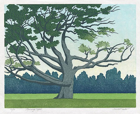
Come on, spring! These two relief prints by artist Mark T. Fowler (1928–2006) evoke the bright greens of spring and the strong winds of March. The colorful ‘Morning Light,’ 1993, is a multiple-block linocut print. ‘Pinus Strobus,’ 1984, is a linocut print as well. A book designer by profession, Mark Fowler never sought to promote or commercialize his art, instead sharing it only with close friends and family, creating just one piece a year for nearly five decades. An extensive collection of his work is on permanent display in our art gallery and you’ll find fine quality digital reproduction cards and prints in the gift shop. Stop by any Saturday, we’d love to see you!
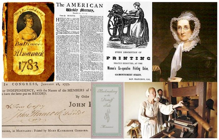
#worldcupofprintinghistory
 Jim Hamilton runs our Twitter account (@MoPrinting). He’s also a soccer fan. So he came up with the idea of a series of printing history milestones in the countries participating in the tournament. What started out as a light-hearted Twitter exercise to promote historical figures like John Baskerville and Alois Senefelder took a serious turn as he uncovered printing’s ties to religion, colonialism, war, slavery, revolution, and censorship. On the other hand, he made some nice connections with printing museums around the world. And if you’ve misplaced your incunabula, well, you just might get a clue to their whereabouts in Jim’s World Cup (of Printing History).
Beyond Words: Book Illustration in the Age of Shakespeare
If you’re in the DC Area, check out this exhibit on book illustration. Meanwhile you can see similar printing presses, type and equipment right here at the Museum.
W. A. Dwiggins: A Life in Design
Curl up in the Romano Library with a grand new book — W. A. Dwiggins: A Life in Design — written and designed by Bruce Kennett, produced by Letterform Archive. Come visit any Saturday, 10–4 and by appointment. Here are a few images. . . .

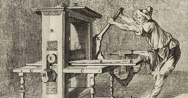
George Phineas Gordon’s Platen Job Press
 Until 1880, inventors had to submit models along with their patent applications to the United States Patent and Trademark Office. Some models were crudely made but others, like this wooden press, were fine and exacting replicas. Known as the father of the platen press, George Phineas Gordon received his first patent in 1850 and submitted over 50 more in his lifetime. This particular patent, No. 148,050, implemented improvements in the operation of the platen, grippers and ink distribution. Gordon’s platen, or job, press was one of the first truly American contributions to printing technology.
The Museum of Printing Type Libraries
Our collection of Mergenthaler Linotype drawings consists of 3,193 black boxes, specially made for storing the drawings. Each box has 100 to 140 sheets, one for each glyph. Each sheet is numbered and there is a summary sheet indicating what glyphs are enclosed. When we received the collection from the Smithsonian 20 years ago, we inventoried every box and prepared a spreadsheet with information on each box. In many cases, the source of the fonts is indicated.
From 1920 to 1960 the Linotype library dominated typeface use. There were fewer than 100 US Monotype services and only ATF and Ludlow had unique fonts, mostly for display. Then came Photon, Compugraphic, GSI, Wang, Varityper, Alphatype, Autologic, Triple-I, and many others. They all needed type libraries and stole freely from Linotype. There is no law against this.
Happy 100th Birthday, Gudrun Zapf von Hesse

Gudrun Zapf von Hesse’s titling font, created 70 years ago as stamps for lettering on leather book covers and spines, is released as a digital font on her hundredth birthday.
Read Ferdinand Ulrich’s article on a remarkable graphic artist >
Museum donates 480 lbs of ink to schools
The Museum of Printing in Haverhill, Mass. has donated 96 5-lb cans of ink to several schools with graphic arts programs. The ink was acquired from the many letterpress shops donated to the Museum over the course of several years.
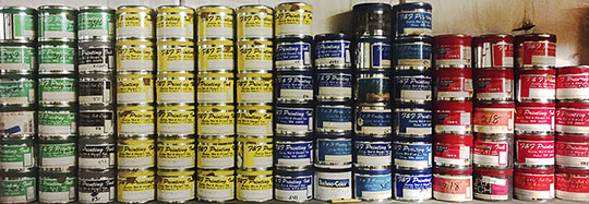
“It is amazing how many letterpress operations are still around. Often they are in basements and garages. Museum volunteers clean them out and move them to the Museum,” said Ted Leigh, Acquisitions Director. “We move all equipment, type, paper, ink, and other materials.”
Robert Bringhurst in Boston, April 2017

Robert Bringhurst and Amelia Hugill-Fontanel at the Society of Printers 43rd Annual W.A. Dwiggins Lecture at the Boston Public Library.
Bringhurst is the noted type historian and poet who spoke on the life and work of type designer Hermann Zapf. Amelia made the trek from Rochester, NY where she is Associate Curator for the RIT Cary Collection.
A fascinating experiment with non-Latin scripts (that works)
Israeli typographer Liron Lavi Turkenich has married two ancient languages in script, and it’s legible. Read more in Tablet magazine >
A place in Haverhill to hold the presses
Boston Globe correspondent James Sullivan paid us a visit. This is what he found.
The latest from William Caxton
A unique example of 15th century printed text by English printer William Caxton has been unearthed at the University of Reading.
The two pages are from a medieval priest handbook dating back to late 1476 or early 1477, which was among the first books printed in England by William Caxton’s pioneering press. No other copies of the pages, printed either side of a single leaf of paper, are known to have survived.
Thanks to BBC Education Correspondent Sean Coughlan, who tells you all about this find >
Self-publishing c. 1917
 Thinking of becoming a literary publisher and printing your books? You have illustrious forebears.
From The Guardian: “A publisher of one’s own: Virginia and Leonard Woolf and the Hogarth Press”
Photo by MaxHund at the English language Wikipedia, CC BY-SA 3.0, https://commons.wikimedia.org/w/index.php?curid=2416900
The Inland Printer
 The most current, up-to-date printing technology — 132 years ago.
The Inland Printer was the longest published printing magazine in the United States. First published in October 1884 and still published on a limited basis “It may have been the first magazine to use a different cover illustration on every issue,” according to MagazineArt.org.
See the industry in all its letterpress glory in the complete second edition from November 1884 here (view or download pdf, 14.9 MB).
New font technology on the horizon
Imagine a single font file gaining an infinite flexibility of weight, width, and other attributes without also gaining file size — and imagine what this means for design.
Anatomy of ATF Type
What is a Type Foundry? A company that makes type.
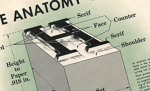
One of the foremost in the US was American Type Foundries (ATF), founded in 1892 when 23 independent type foundries consolidated. These foundries were brought together for several reasons, one being that the Linotype, which produced a line of type, was introduced a few years earlier and was cutting into the sales of hand set type. Another was that the type produced by the various foundries was not systematic — point sizes and baselines varied between companies.
Remembering Hermann Zapf (Nov. 8, 1918 – June 4, 2015)
Hermann Zapf was the preeminent worldwide typeface designer and calligrapher who lived in Darmstadt, Germany. He was married to calligrapher and typeface designer Gudrun Zapf von Hesse. His typefaces include Palatino and Optima.
I first met him in 1960. I was the mail boy at the Mergenthaler Linotype Company in Brooklyn, NY and was delivering the mail to his cubicle on the 8th floor. He was adapting Palatino for the Linofilm. One day I got up the nerve to ask “Mr Zapf, what do you do?” He replied, “I correct the errors of my youth.” For example, the lowercase y had a curved calligraphic descender. He straightened it out. Those who stole Palatino from the hot metal version had something different from those who stole it from the phototypesetting version.
Our Favourite Typefaces of 1915
From the wonderful type blog Alphabettes:
It’s been an exciting year in type; one that saw many technical innovations, company mergers and restructuring, as well as some delightful new font releases which we will surely encounter in printed matter around the world soon.
But let’s start with the biggest loss for our industry in 1915: Georges Peignot, type founder in Paris and one of our greatest type designers — of Grasset, Auriol, or Cochin to name a few — died in battle, only 43 years old. Curious to see how long the foundry will be able to remain independent without its head :/ Another substantial loss was the death of Wilhelm Woellmer’s CEO Siegmund Borchardt. His son Fritz (34) suceeded him at the Berlin foundry.
Typejournal.ru
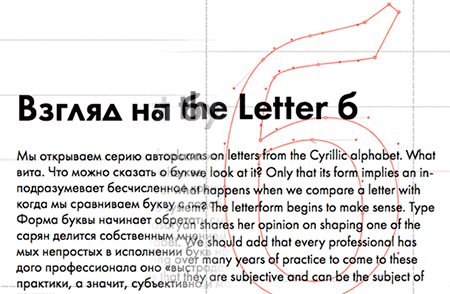
Just discovered a fantastic online journal devoted to type design, visual culture and typography. It’s in Russian and English and covers a lot of ground but will be especially interesting to you if you’d like to learn more about Cyrillic type forms and typefaces. Go there now: http://typejournal.ru/en/
(via Ilya Ruderman)
History of the Linotype Company by Frank Romano released
 No single machine impacted the setting of type as did the Linotype. At the time of the Civil War, typesetting was the second most common occupation in America, surpassed only by farming. Both were done primarily by hand. The Linotype machine mechanized typesetting. Outside of Gutenberg’s invention of movable type no other single machine has had the impact on printing as has the Linotype.
The Monotype Recorder Online
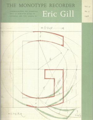 You can read or download (as pdfs) over 60 issues of the Monotype Recorder on the Metal Type website.
(This discovery courtesy of Mikko Vierumaki and Erik Spiekermann on Twitter)